I could've done that

You know the scenario. You’re in the museum heading to the next wing and overhear someone say, “I could have painted that.” Then you realize the viewer is in front of  Helen Frankenthaler’s Canyon, painted in 1965. I just smile, roll my eyes and head to view Picasso’s work. Sure, sure, some of these masters’ works looks as if the artist blindly tossed paint on a canvas, but that “tossing” comes with years of experience. My clients do what they can in-house, but turn to my design sense when they want to take an idea further and respect my design capabilities.


Know when to toss your own paint and when you should collaborate. Ciao,Lynne

That line of type of time needs more Kroning.

What my client meant to request is Kerning. Which seems to be of interest to my clients lately. No kidding; in a meeting someone asked, what is that called? “Kerning,” I responded. Thinking only designers obsessed with typography really care. So, what is kerning? In typography, it’s the process of adjusting space between letters to achieve a more visually appealing outcome. Usually designated to individual letter pairs in headlines or large type. Tracking has do with the uniform space over a range of characters.

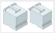
So, a little history thanks to Wikipedia: In the days when all type was cast metal, a corner was notched to a consistent height on one or both sides of a letter-piece. Such notched pieces were only set against one another, not against unnotched ones, which had straight sides. The corner allowed for a character’s features to reach into the area normally taken up by the next character, for example the top bar of the T, or the right diagonal stroke of the V to hang over the bottom left corner of an A. Having a consistently shaped corner cut out allowed for using fewer pieces of type to make up all possible kerning pairs; for example a T- and V-piece with kerning on the right would match the same A piece with a matching kerning indention on the left.

So why bother with this at all? Readability. Beauty. Knowledge. If you view the A and V without kerning you may notice your eye focuses on the space between the letters — slowing down your ability to read and absorb the message. A trained eye appreciates the attention to detail, of uniting those letters so they work together. It’s an understanding of space and the necessity of adjusting that space when letters vary in shape. Following is an example of this in my design for my client, the headline required kerning.

So, go forth and Kern and appreciate the visual beauty of type. Ciao, Lynne


Sometimes the Fine Print is Worth the Read

If you’ve followed my blogs, you know I love micro brews. These handcrafted, innovative beers seem to satisfy my thirst in ways a smooth, rich Malbec or crisp, fruity Sauvignon Blanc just can’t touch. There’s something feisty and irreverent about these brews, which is often echoed in the beer labels. Before opening my beer, I usually study the design of the label and read the fine print. Yup, the fine print. Sometimes it simply states the alcohol content and city of origin, and more often some clever copy. So was the case with Little Sumpin’ — as I was admiring the label my eye was drawn to some tiny text (probably 4 point; which is classically how designers bury obligatory text that is invading the design) —yet this was outlandish and funny and worth reading. My point. Sometimes the fine print is a jewel. Want to know what it says? Go grab one from your fridge.

What about the Banana?

I’m just saying that somehow the pineapple became the symbol of hospitality and the banana, well, let’s just say its backstory is more colorful. American colonists began importing the pineapple in the 17th century — this rare, exotic fruit soon became significant to give to guests; and given the voyage between America and the Caribbean islands was slow and dangerous, it garnered even more prestige. As the years passed the pineapple was being used to decorate the home. The banana, too, was important historically in many cultures and even made its way into textile design. Later on it was seen as exotic and adapted in Europe and America. So it’s looking like Americans like exotic fruit. Step into 1923 and you have a song titled, ”Yes, We Have No Bananas!‘ Then there’s the slipping on the banana peel use. In the 1940’s the banana became sensual — Miranda and her fruit basket and dancing. Even Andy Warhol gets in the picture. The album cover for The Velvet Underground & Nico has a painting by Warhol of a banana. Apparently early copies of the album had a banana which you could peel — “Peel slowly and see” — which revealed a flesh-colored banana underneath. Where is this going? No where really. Just amused at the meanings we create and became more interested as I painted this image — this soft, elongated fruit has a very different appeal (sorry) compared to the prickly pineapple.

Out of Chaos

Comes order. Or does it? Chaos theory is a scientific principle describing unpredictability of systems. The behavior of these systems may appear random, but actually they have order and finite boundaries. This started to sound like the creative process to me. As I’m brainstorming, it appears chaotic. I’m researching the project, reviewing typography, sketching ideas and just formulating a visual direction. At that moment I don’t know the outcome, and yet I always arrive at my design destination. The  more I read, the more complex the ideas until my brain was swimming. For example,

“Wheatley quotes researchers John Briggs and F. David Peat explaining the process of oscillation: Evidently familiar order and chaotic order are laminated like bands of intermittency. Wandering into certain bands, a system is extruded and bent back on itself as it iterates, dragged toward disintegration, transformation, and chaos. Inside other bands, systems cycle dynamically, maintaining their shapes for long periods of time. But eventually all orderly systems will feel the wild, seductive pull of the strange chaotic attractor.”

Feel like grabbing a towel? Though completely fascinating, the theories can become esoteric. I arrived at this — something that I create seems miniscule in my life, but has far reaching affects that I may never personally realize, and yet, just that potential makes me want to create better design. I blame all this hoopla on wireframe mode. While working in Illustrator you get the option of looking at your line work in wireframe mode and suddenly you see the skeleton of your work (see below) and these thin lines that hold little form and yet fascinate me. I start changing things in this mode that wildly affect the design and it isn’t visible until I go to original view. Just maybe the Butterfly Effect even affects the world of design. I’d like to think so.
Comfort Design

Why not? There’s comfort food. Who doesn’t like to feel good by indulging in those tried-and-true, nostalgic foods like mac-n-cheese. I figure some design calls for comfort, too. Easily recognized. Predictable. Simple color breaks and shapes. Introducing the Jack O’ Lantern. The carved out pumpkin appearing at front doors in October as Halloween nears. The name comes from an Irish folktale about a man named Stingy Jack; Irish immigrants brought the tradition to America. I gotta say I’m a softy on comfy tradition; every October I start my pumpkin search and anticipate bringing life to this gourd by carving out shapes, throwing in a lit candle and admiring its ghoulish face. Sometimes pushing the envelope means knowing the same old envelope is just fine. Simple design and recognizable shape is memorable. And, comforting.

Negative Space

It’s hard to believe that “negative space” is favorable, given the term. But it is. In drawing classes, we drew the space around the object — the negative space. Sometimes that space around a subject forms an interesting shape. Sometimes it’s a much-needed visual relief. A pause for the eye. In drawing classes, the professor had us draw the space, rather than the object, hoping to unlock our minds and create a more accurate drawing. In the attached sketch, I drew the objects while walking through a gallery in Italy. Three rooms of Giorgio Morandi’s works — a still life of 5 objects – a vase, bottles, bowls, etc. I guess most people would be bored, but I was seduced by the monochromatic palette and beautifully painted objects. His study of light and tone and compositional balance. It was soothing. I think that’s the beauty of negative space, in its absence there is something quietly formed. It’s in contrast to the positive – the object we do see. My suggestion as avisual artist — look beyond the object.